Color psychology in the gardening industry – how to influence customers


Colors start working on brand recognition long before a customer ever interacts with a product. Hidden under the guise of aesthetics, they are a crucial part of the full brand experience. By consciously managing the color scheme of your stand, shop, or promotional materials, you can influence emotions, purchasing decisions, and the way customers remember your offer. At adsystem, we've been helping brands unlock this potential for years. Find out how to use colors effectively in the gardening sector.
Colors that embed your brand in customers" memory
Color works faster than any slogan. It's the first thing that catches the eye and triggers emotions – before a customer even blinks, they already sense whether they want to stop at your brand or move on. Brands can harness this natural reaction by applying color psychology. It’s a tool that helps create associations, amplify feelings, and gently nudge customers toward a purchase.
adTips
Well-chosen colors deliver results faster than many marketing slogans. When you use them consistently, customers don't even need to read a brochure to know who you are. Colors become your visual code – immediately revealing the character of your brand.
In the gardening sector, earthy tones naturally dominate. Green leads the way, instinctively linked with harmony, freshness, and calm. It gives customers a sense of peace and trust in product quality. Brown, found in soil and bark, evokes strength, durability, and stability. And beiges and greys? They work quietly in the background — creating a neutral setting that lets products stand out without visual clutter.
Earth tones fit perfectly with customers' expectations for a natural connection. But leaning too heavily on similar shades can make many stands and shops start to look alike. In a sea of green, it becomes harder to stand out, and customers quickly stop noticing the details.
It’s worth introducing accents that liven up the space without breaking away from the natural theme. Vibrant flower reds, sunny yellows, and bold pinks create clear, nature-inspired highlights. These colors, pulled from a garden’s palette, catch the eye, add energy to the display, and strengthen brand memorability.

Designing the customer journey – using colors to guide visitors
When entering a stand or store, customers instinctively follow what catches their eye – and often, that's color. Color acts as a silent guide, suggesting where to turn, pause, or speed up.
Green works well at the start of the customer path. In stronger shades, it grabs attention and signals brand character. In softer tones, it soothes and invites customers to browse calmly. Beiges and greys work best in the middle areas – they don't distract but allow full focus on the products.
Warm accents like yellow or orange play a different role. They grab attention, spark urgency, stir emotions, and silently encourage: “Check this out!” or “Get it before it’s gone!”
Seasonality and color shifts – how to keep customers interested
A garden changes with every season, and a gardening brand can do the same. A steady color palette is the foundation of your brand. But there's nothing stopping you from planning seasonal promotional campaigns that refresh your visual identity.
In spring, pastel tones like mint, light blue, and soft pink immediately evoke new beginnings. In summer, vivid colors like sunny yellow, orange, and rich green take center stage. Autumn welcomes deeper shades – burgundy, gold, and warm brown. In winter, it's better to lean on muted whites, greys, and silver accents.
By adjusting your colors to nature’s rhythm, you remind customers that your brand evolves alongside their world. You also create an emotional bridge – after all, nobody likes feeling stuck while everything else moves forward.
Seasonal changes don't have to mean a full overhaul. Sometimes it’s enough to swap a few color accents, adjust the background slightly, or launch a campaign in a fresh color scheme. The key is making sure customers feel there’s always something new to discover at your stand.

How to use colors to boost brand visibility at garden trade fairs
Your trade fair stand is where all your color decisions come into play. If your colors have successfully guided customers through your physical or online store, the trade fair is where you need to go further: you need to make them stop at your stand.
There’s no universal recipe for the perfect exhibition stand – at least, we haven't found one. Every project must be tailored to the brand: its character, offer, and audience. But don't worry – we have a few tips (and products!) that will make a difference.
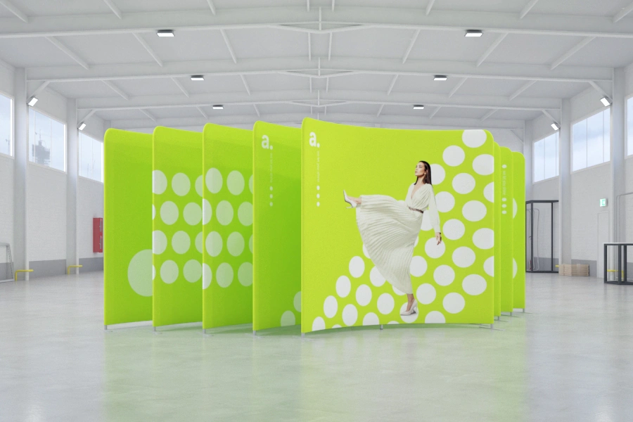
Start with a strong foundation. A promotional wall with well-designed graphics and a catchy slogan is your first anchor point. By applying color psychology, you can pack key brand information directly into the wall. It sets the tone: telling customers who you are and giving them a clear reason to come closer. A wall like this doesn't need a hostess – it makes the first move on its own.
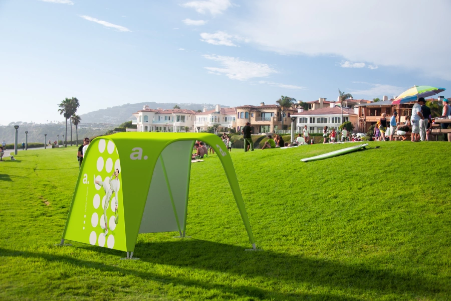
The gardening sector offers a major advantage: you can tap into associations with relaxation and nature. If you have enough space, consider setting up a small relaxation zone. Under a branded tent, place foam beanbags, logo deckchairs, or small tables. This way, you’ll recreate the laid-back atmosphere of a garden, naturally extending your brand's message.
Want to go even further? Use illuminated advertising lightboxes. They’re a simple way to make your stand visible from a distance and ensure your messages remain clear, even in a crowded hall. Minimal effort, maximum impact.
Don’t let your brand fade into the shadow of neighboring stands.
Choose exhibition solutions that grab attention – at trade fairs and beyond.


